Dynamic fixed width layout with CSS
Recently Cary and I have been trying to optimize our site for different devices and ran in to some issues. Particularly if we wanted to have a site that would work well on an iPhone it was comically large on the iPad. And the awesome iPad version was teeny-tiny on the phone. With more digging into the viewport meta tags there was no good way to select a tablet layout vs. a phone layout – you just have the one viewport and that’s it. The only decent way to determine which device you have is to set the viewport’s width to be device-width:
<meta name="viewport" content="width=device-width" />
But if you do that you are stuck at the native widths for the devices. You have the default 320px for portrait iPhone or 1024px for landscape iPad, and a number of other variations.
That all well and good if you want to design specifically for those viewport sizes – but if you want to set a custom viewport for the phone and for a tablet, which is what we wanted, then a little more trickery is involved. But the end result was really very slick and, stay with me here, maintainable.
Something I was calling “Dynamic, stepwise, fixed-with layout.”
To pull this off you need to things:
Set the viewport for your device
Update the viewport via javascript in the head of the HTML:
<meta name="viewport" content="width=device-width" />
<script type="text/javascript">
  if (window.innerWidth < 500) {
    // Phone
    document.querySelector("meta[name=viewport]").setAttribute('content', 'width=480');
  }
  else if (window.innerWidth < 650) {
    // Tablet
    document.querySelector("meta[name=viewport]").setAttribute('content', 'width=670');
  }
</script>
This has the viewport default to device-width which lets us grab the size of the window, and set it to our custom size.
I put this JS directly in the header, and have it evaluate immediatly because I don’t want the screen to ‘jump’ around after it loads.
Add custom styles for that viewport
Once I have that new viewport size I can use CSS media queries to style the page for the devices.
@media screen and (max-width: 500px) {
  /* Phone Styles */
}
@media screen and (max-width: 700px) {
  /* Tablet Styles */
}
The really cool thing about this approach is you can dynamically set the width of your content to an arbitrary value based on the device size.
Added bonus, as you resize the browser window on your computer you will also get the custom layouts. Which is particularly nice for testing.
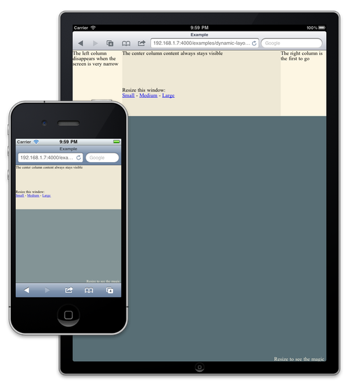
Check out the Example.